A faded photocopy effect background texture

HEYA

Drop me a line through form below, or send me an email at leolucagamberini@gmail.com.
Thank you! Your submission has been received!
Oops! Something went wrong while submitting the form.
Pushing the boundaries of an experiential marketing agency
Brand identity
Website
Campaign
Motion
**********
As an ongoing freelance Creative Director, I've had the privilege of partnering with Creative Noize, an experiential marketing agency based in the U.S. Creative Noize specialises in culturally driven campaigns that seamlessly fuse live events, influencer strategy, digital storytelling, and community engagement, boasting an impressive client roster including Netflix, Nike, Adidas, RCA, and the American Red Cross. My core responsibility has been to define and evolve the agency’s visual identity and overarching creative direction, encompassing both its internal brand presence and the diverse campaigns we collaboratively produce. Their previous branding didn't reflect the calibre of their work or their high-profile clients, creating a clear opportunity to elevate their visual presence.

Client

Creative Noize

Year

2025

Industry

Campaigns | Experiences

Collaborators

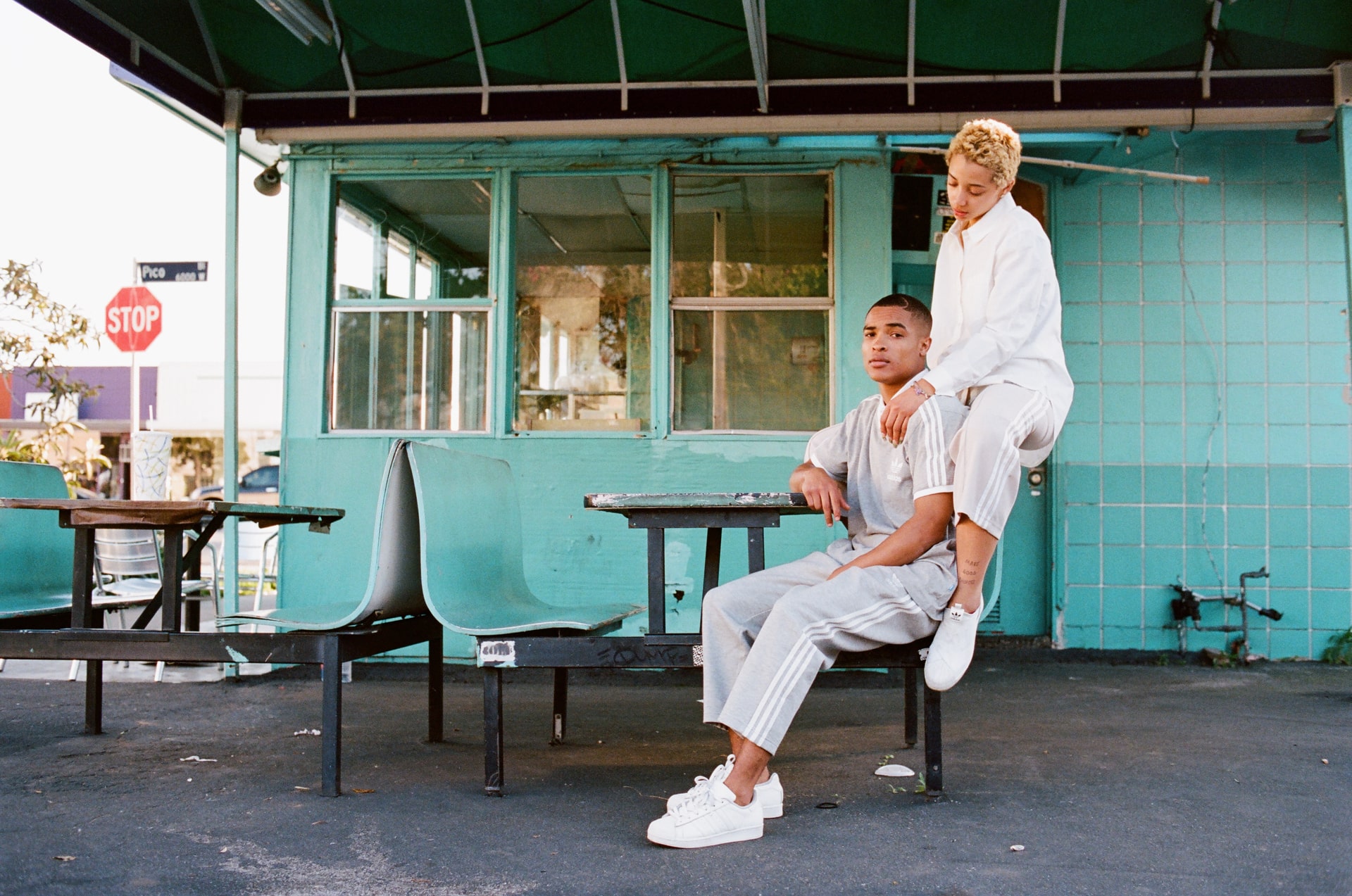
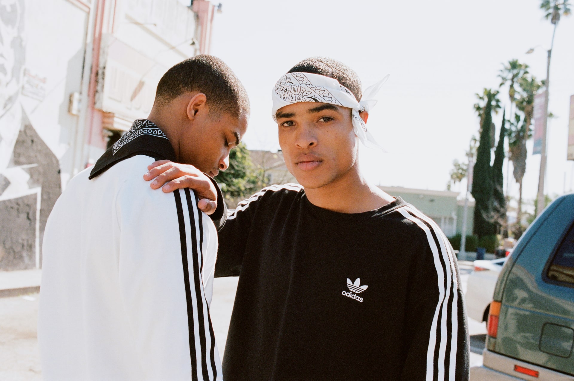
Photography & Video:
Creative Noize

Website

A disruptive visual language

My objective was to represent Creative Noize as a disruptive, culture-shifting force. This led to a design system built around distorted and stretched typography, which visually embodies their energetic disruption and the bold statements they make in the industry. This bold, expressive identity, crucially, maintains enough control to function cleanly across all digital and print applications, from stripped back legal documents, to high-stakes pitch decks, to dynamic social media content.

Letting client work shine

This identity needed to express the disruptive personality of the agency, but be able to take a back seat where appropriate to spotlight their client work. A stripped back colour palette, a strict grid-based system and a typographic quirks allow the brand to be scaled up and down according to need.

++++++++++++++++++++++++++++++++++++++++++++++++++++++++++++++++++++++++++++++++++++++++++++++++++++++++++++++++++++++++++++++++++++++++++++++++++++++++++++++++++++++++++++++++++++++++++++++++++++++++++++++++++++++++++++++++++++++++++++++++++++++++++++++++++++++++++++++++++++++++++++++++++++++++++++++++++++++++++++++++++++++++++++++++++++++++++++++++++++++++++++++++++++++++++++++++++++++++++++++++++++++++++++++++++++++++++++++++++++++++++++++++++++++++++++++++++++++++++++++++++++++++++++++++++++++++++++++++++++++++++++++++++++++++++++++++

Next project

American Red Cross

Go